Pages

Tuesday, April 11, 2017

Color Spotlight: Portland Gray

There she is, in all her glory.

Portland Gray.  The adorable misfit and the will to be weird of grays.  It's a cheeky gray with lavendar based undertones, that lives up to it's name, certainly.

I've been working on my art studio/guest bedroom for a number of years now. Fortunately, or unfortunately, the room is in the basement, tucked away from everyday living.  So, shutting the door and pretending the project doesn't exist has become somewhat of a routine.

Initially, I was wanting a stark white studio.  I mean, it's so modern and whatever, and any decor would totally pop against the paint.  But because the studio space is so big, it felt really cold and impersonal.  As it turns out, I have an attraction to white furniture as well. Needless to say, white furniture and white walls weren't doing the room any favors.

For reference, you can see the studio renovation progress here and here, and some additional photos below.  The walls at the time were painted Decorator's White by Benjamin Moore.  And because the walls were a little defective, we stuck with eggshell (to hide minor imperfections, but also for wipe-ability purposes).


Let me remind you that this room is pretty large - we knocked down the dividing wall that separated two bedrooms and turned it into this giant, bomb diggity, hangout spot.

After a couple of years of the bedroom being stark white, I got a hair up thee ole ass and started cutting in using some leftover Moonshine I had laying around.  I'm a big fan of Moonshine in small, windowless spaces, because it makes the room feel magnified.  But in big, bright rooms, it was showing a lot of green... a color I've been told to stay away from because it competes with warm tones.

Who pays attention to color advice anyway?

After cutting in 98% of the room, I let my logical self live with it for a few months, opening the door every so often to catch a glimpse of how the colors were coming across.

My facial expression was always questioning. And when my face says it all, it's a good sign it's not meant to be.  I told myself the next time I take a paintbrush to that room, it's because I found a forever color.

Then something amazing happened within the last week.  On a fluke, I found my forever color.  And yes, the name may have pushed me to do it.  Oregon is my favorite place on Earth.  Ever.  And Portland is my home away from home.  So, why wouldn't I want to spend time in a space painted after one of the greatest and weirdest cities on the planet?

It all started when I found myself on Pinterest looking for "unexpected neutral colors," and came across Elephant Gray. After looking at about 50 bathrooms and 30 bedrooms painted Elephant Gray, I knew I was close to solving my paint color dilemma.

Because this guest room/studio space is my haven, I finally understood the value of creating this space for me, and making choices for me, not choices that someone else may appreciate.  What I did like about Elephant Gray was how feminine it came across in every space.  With its plum undertones, it looked gorgeous combined with light grays, bright whites, and teak/walnut stains.

But... it was too dark.  Too purple.  Yet so close to what I wanted.

I started clicking on shades that were close to Elephant Gray, and came across Portland.  I knew that was my golden ticket to bedroom/studio inspiration success, and went for it. Well, kinda. I picked up a quart of Portland in eggshell to confirm via patch test, and ended up finishing off the quart, painting one wall, last night.  Even this morning I woke up extra early to see how the color faired at sunrise. Um, gorgeous.

Similar to the big paint job in our main living space using Gray Owl, I had this feeling that this is the color that is going to stick with us until the next family decides to paint over it.

It's difficult to compare colors when you're looking around online, but just for fun -- because looking at paint swatches is the funnest! -- you can see the differences and similarities between Elephant Gray on the left, and Portland Gray on the right.


And what kind of person would I be if I didn't leave you with a little room preview - and I mean little. I will be back to update this page once I sort my life out, and my studio.  Oh, and hey!  If you like what you see, er, read... subscribe!  You can never have too many self-esteem boosters.


Monday, March 20, 2017

Exploring Deep Space - Faux Fireplace Overhaul

I started this project on a whim, with no plans or expectations.  As you may have read in my previous post, Color Spotlight: Gray Owl, the entire upstairs got a paint job.  Well, most of the entire upstairs with the exception of this little faux fireplace built-in.  Behind all of that was a big, patchy, multicolored mess from all the years of painting and repainting.  


To be truthful, when the faux fireplace was installed four years ago?? it was never actually completed.  There was a lot of trim work that was missing because, eh.  

I really loved the concept of having said faux fireplace bookshelf thing, but to be honest, it was way too crowded in our living room space.  Initially, the faux fireplace bookshelf worked within the space, however, when Shane built the Tree Rings cabinet, the space got pretty jammed.  Now, being the minimalist I am, the cramped space totally bummed me out.  So much that I found my nutcase self moving the other pieces of furniture around on a weekly basis, only to move it back, then back the other way.  Last week I finally came to my senses, realizing that the living room was never going to look right until I did something about the giant mass sitting dab smack in the middle of the room.  So, I did what any loonie would do on their lunch break; I grabbed the rubber mallet and gave the fireplace a few knocks.  By the time my break was over, the shelf was successfully removed.  


Board by board, I deconstructed the built-in until I only had the mantle part remaining.  The mantle itself had absolutely no support, wiggling and wobbling, ready to snap under the weight of the top. So, I leaned it up against the wall and called it quits.  Because, well, no plans or expectations.


Time had passed and I still didn't have a clue what I was going to do with this mantle.  I really wanted to utilize it somehow.  I love a tiny house, but lately I am realizing how quickly we are running out of space for unique additions such as this.

I made a trip to the garage and found some wood scrap pieces; reconstructing the base of the mantle.  But even after adding the scrap pieces, the mantle was still movin' and shakin'.


After sorting through the pile of extra wood from disassembling the faux mantle, I found a few pieces that would aide in increasing support, and secured them to the back of the mantle with a nail gun.


The mantle went from 20 pounds to 50, I swear.  But, it wasn't going anywhere.  I mean, literally.  It just hung out.  It wasn't until Big Bull Gretzky spotted a crow in the tree eight houses down, freaked out and bumped the mantle.  In slow motion the mantle leaned farther and farther and because I am such a badass, I ran to rescue the 50 pound tipping mantle, catching it with my now bruised bicep. Girl power.

The mantle was in fact heavy AF.  My bruised bicep told me so, but it was certainly not secure.  The final decision on location needed to speed up, which resulted in the mantle sliding two feet, right into the dining room.  A few anchors and furniture wall straps later, the mantle was secure.  This time it really wasn't going anywhere.


The faux fireplace has seen it's share of dings and dents.  After some patching and sanding, the mantle was looking a little hot and a little messy.  Since I conveniently ran out of the Gray Squirrel paint by Benjamin Moore (it molded), the opportunity to explore other colors presented itself.

Side Note: My husband loves outer space.  He told me once (several times really) that if we never met, he would have been first in line for the Mars Project.  It's close, but I'd say he loves me more than the solar system.

Up until this very moment, Shane just thought I was crazy for moving shit around, again.  He's right.  And to thank him for putting up with me, I wanted to incorporate a color just for him.  I present to you, Deep Space by Benjamin Moore.  It's a very dark, slate-like blue.  Needless to say, he was a fan.

So was I.  Now we can make routine visits to deep space anytime! And seriously? Check out that sexy trim job.


I really liked the idea of having shelves in the mantle, but as I said before, it was just too much noise in such a small area.  The noise was accompanied by anxiety when it came to decorating, and more to dust.  Now, I can still decorate the mantle for all seasons, but it isn't hoarding space in the process.  Just clean, simple, lines.  The best part is the mantle is officially portable, which means endless possibilities!  Maybe I'll move it somewhere else in a week?  The odds are always good.
The mantle is more or less a piece of wall art now; similar to the chair at the Walker that's adhered to the wall with two legs and a tissue box sitting on top.  Seriously.

The other side of the room is a different story.  I'm currently on the hunt for a decent MCM or Danish inspired credenza/media console that doesn't cost a mortgage payment.  Until then, the remaining built-in piece is going to have to hang out until I'm ready for it.  It's a start anyway.  Wishing you all a fabulous first day of spring! 


Thursday, March 16, 2017

Color Spotlight: Gray Owl

Is there is such thing as New Year's irresolution?  If so, I'm totally owning it.  I'll be honest when I say that even though I feel like I have been busy with home projects - they are the kind of projects that don't require a lot of skill, how to's, or shortcuts - and are probably not worth documenting, or your time.

We have a ton of projects on the back-burner, waiting for better weather.  A few include new windows, patio door, kitchen remodel, and a continuation of landscape updates from last year. Confident my plants decided to die and not come back this year, but only spring will tell.  This means, big bucks being spent.  It also means hanging around the house more saving for said bucks.

But...

With all of this time being spent in the house comes itches and scratches of wanting to do things that are more or less in my control.

For example: Repainting the upstairs for the fifth-ish time.  I've been sitting on the fact that I wanted to repaint everything upstairs for months now, but was waiting for the perfect opportunity.  I got that when Shane left for the weekend.  Husband is away, paint brush comes out to play.

Up until a couple weeks ago, we had a combination of Manchester Tan and Shaker Beige splashed across the main living area walls.  People change, style changes, preferences change.  I know I've mentioned in previous posts that the Manchester Tan was a paint color suggested by one of the specialists at Hirshfield's.  Although they are extremely knowledgeable, I was blindly asking a specialist what color to paint my living room, a place she had never been. Color of the year in 2010 was none other than Manchester Tan, so I can understand the suggestion.  However, just because it's a beloved tone, doesn't mean it's treasured in this piece of split.  Our windows face east and west, and in natural daylight, the color was tolerable.  But when the sun started setting, the color took on this I've been smoking three packs a day inside my house yellow.  Ishy.

Picking the color was a whole other battle.  I researched various colors starting in October, and just wrapped up painting in March.  The goal is to never paint our upstairs, like ever again.  After reading hundreds of thousands of reviews on cooler paint colors, I settled on Gray Owl.  Here is why:

Gray Owl Know-it-all:
  • Gray Owl is dominantly gray with cool, soft, and passive undertones of blue and green.  Which means, it looks badass with a variety of wood stains, stainless steel, and creams/whites.
  • Gray Owl is a light paint color - It's not light enough to be classified as an off-white, but it's also not a medium hue either.  In fact, it's right dab smack in the middle of "light."
  • With any light gray, it is susceptible to reflection and can pick up other tones from it's surrounding environment; i.e. If you have a navy accent wall, it's going to pick up the blue.  If you have a vintage forest green Chesterfield sofa, your walls are going to appear a bit on the green side.
** An added tip: Pair your Gray Owl walls with trim painted in Super White for a bright pop of freshness.  The two colors share similar undertones and go very well together.

As I was saying, we live in a typical split entry home.  For our home I used a combination of Eggshell and Flat finishes, and ended up purchasing 1 gallon and three quarts of Flat and 1 gallon of ES.  With this amount I was able to paint our downstairs and upstairs hallway, entry, living room, dining room and kitchen space.  Whatever color you're covering up plays a huge role in how much paint you're going to need.  If you have dark walls, double the amount.

Also, keep in mind that there is a huge difference between the two finishes - Eggshell has great wipe-ability with a bit of a sheen, so imperfections stand out a little more.  Flat is great for areas that don't have perfect walls - if your sheetrock is a little wonky, or if you live in a older home with plaster or a lot of imperfections from artwork being hung up over the years.

The way the house was painted with the two finishes was very strategic.  The two sheen's weren't mixed, except for one wall on accident.  You could see the eggshell punch through the flat.  Took a few coats to cover it up.

And without further adieu, a few before and afters of the back breaking work.  Don't worry, I'll pat my own back.

The best example can be seen in our entryway - and for the fact that I seem to have the most photos of our tiny entry?  For some reason?  It's best not to ask.

2015 ish after a new door and railing with Manchester Tan
As seen today with Gray Owl
No doubt do we have additional improvements to make - more things to hang - more things to paint. But if I had to pick any of these looks, I'd say I'll reveling in the best one yet.

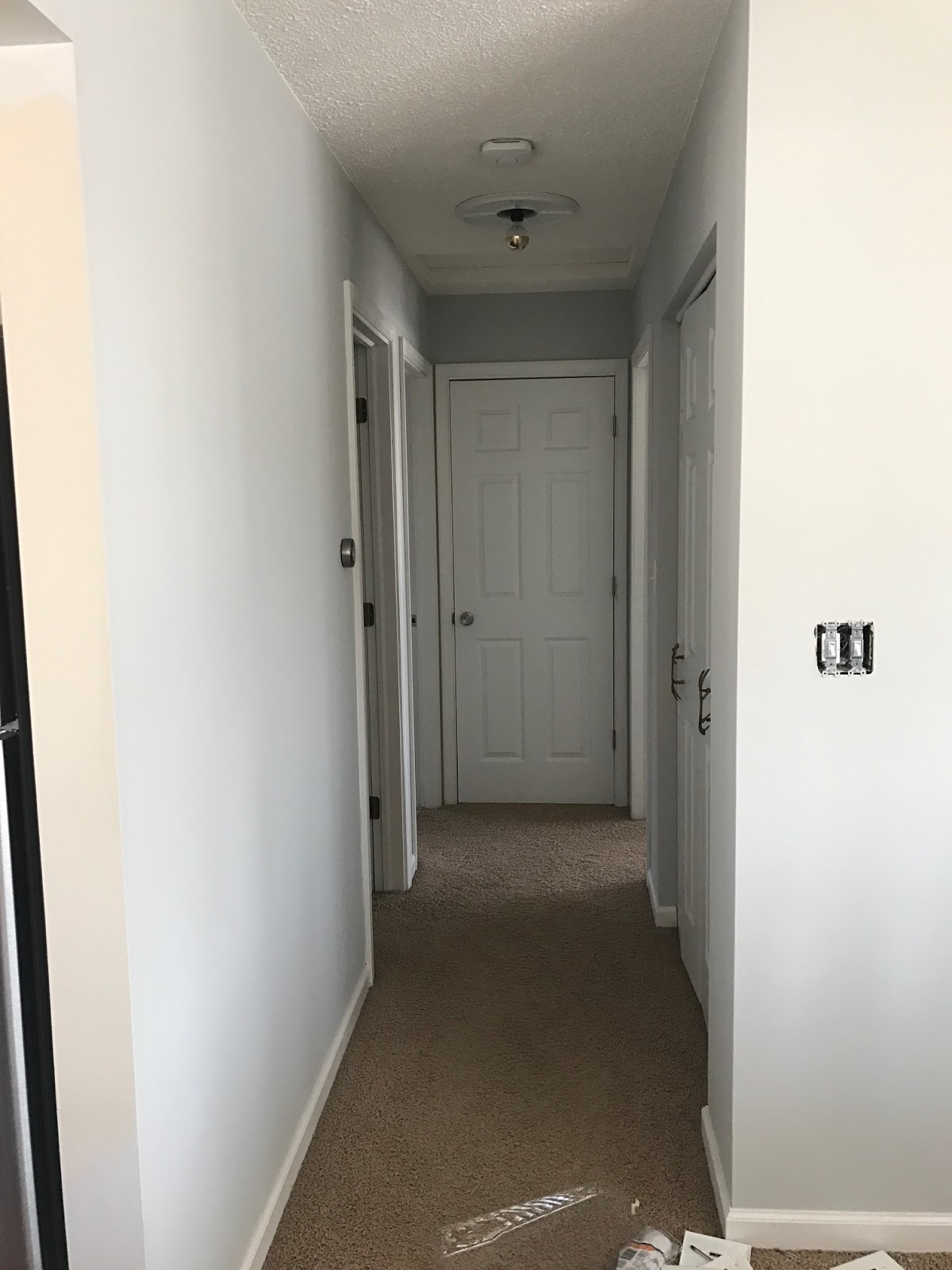
Another semi-decent example is our upstairs hallway.  Please disregard the areas I didn't paint when the photo was taken - on second thought, maybe you should take a look so you can compare the yellow dirtiness of the Manchester Tan to the so fresh and so clean, clean Gray Owl.


And finally, a shot of the faux fireplace - that also got a major overall!  (Check back soon for this update) You can easily compare the two paint colours.  **Photo taken in natural light


Well, I guess that's it as far as photos that capture the impending change.  I'm hopeful the frequency of these little posts change, but you can't rush a good thing.  As always, thanks for reading!