Art is super subjective, so make it count. The key when choosing your art pieces is to find ones that;
A. Make you feel something
B. Is special and personal to you. Heck, everyone is creative in some way. Apply those talents and try to create something uniquely yours!
C. No matter how many years you have had it, you still stop by once in a while to say hello.
D. Are originals and support local, and starving artists (people like me) when you can.
Things to avoid:
A. Don't buy just to buy. You need to fill up that giant empty wall space? Maybe give it a little thought first.
B. Don't buy art to impress others. Other people don't live in your home. You are ultimately the one that has to look at it.
C. Unless you really like that super famous and slightly overused painting, try some originals on for size. Etsy is a great place to check out. You can purchase incredible prints from passionate artists. We are big advocates for all artists in our home, but you get to a point when you have seen Starry Night (guilty) or Scream one too many times. Another place to check out? Your local thrift store.
Ch, ch, check, check it out- www.etsy.com
Hooks are not only functional, but they can also serve as decor. There is an abyss of hooks to choose from out there. Antique hooks, basic hooks from home improvement stores, or my favorite, STATEMENT hooks. Capitalizing statement really made a statement, eh? Here are a few examples of some that hit my happy bone.
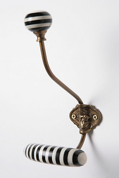
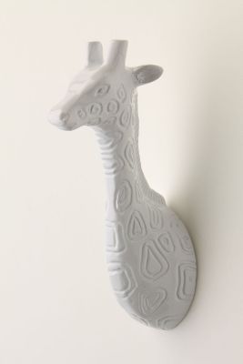
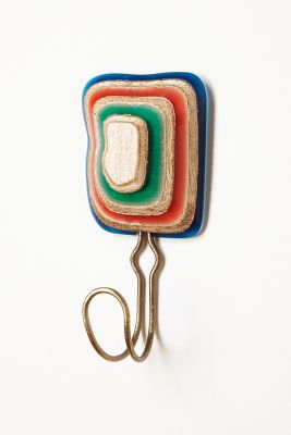
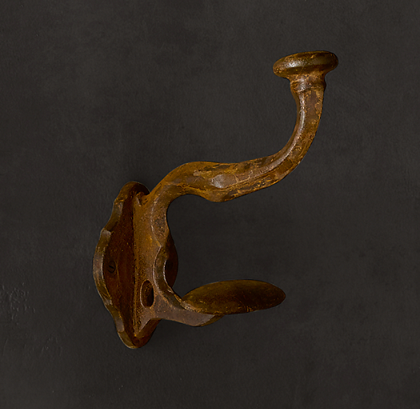
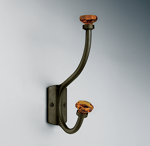

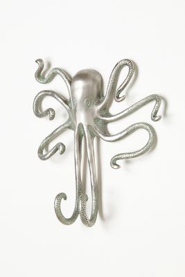
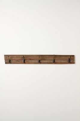
If you can't justify spending $18.00 or more dolla dolla bills y'all on a single hook-- and we totally don't blame you, we can't either-- then consider fashioning your own. Get some basic hooks and a piece of wood for a couple dollars at a home improvement store. You can even check out Craigslist for free old barn wood, hopefully termite free. Maybe a can of spray paint- PRIMER FIRST, a couple eye hooks and wire in the back, and go to town. The barn wood piece displayed above is a prime example of what you can make for a fraction of the cost. Awesome show, great job!
Sources:
anthropologie.com
restorationhardware.com/
Floor. You need a floor to walk on, obvi. Just a tip: I am a big advocate on not having white tile.. because we do. It blows balloons. You may think, Eureka! White will make the space look so much bigger and cleaner! No, just no. I am going to stop your unreasonable thoughts right there. White tile will show everything. Go ahead and get it though if you live to clean... er... clean to live?
If you stop to think about how many times an entryway is used in a given day, you would be surprised. It is the portal for coming and going. Your floor should be strong enough to hold up to the every day homecomings. Meaning, your floor should not be made of hay or dirt. That is kind of a bad idea, but tile is never a bad idea and hardwood floors are always genius. Together the two make the sexiest hybrid floor to date.


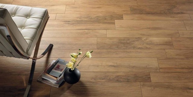
Told you so.
Paint can make or break your home. A few posts ago I talked about all of the different paint color we had in our home the last seven years. Needless to say, we had a very broken home. Paint takes thought. If you are using multiple colors, they should be cohesive with one another. So, no gray with a warm base mixed with a cool base. It.does.not.work. I hate to say that you need to sacrifice color, because that shouldn't be the case. Just find harmony. Also, keep in mind your trim color. If you changing it will make the world of difference in your home, why not? With that said, we went against the grain a bit this past weekend. I've always thought trim should be white or wood. No, no. Not the case.
Enter exhibit A.
See? White floors suck suckers.
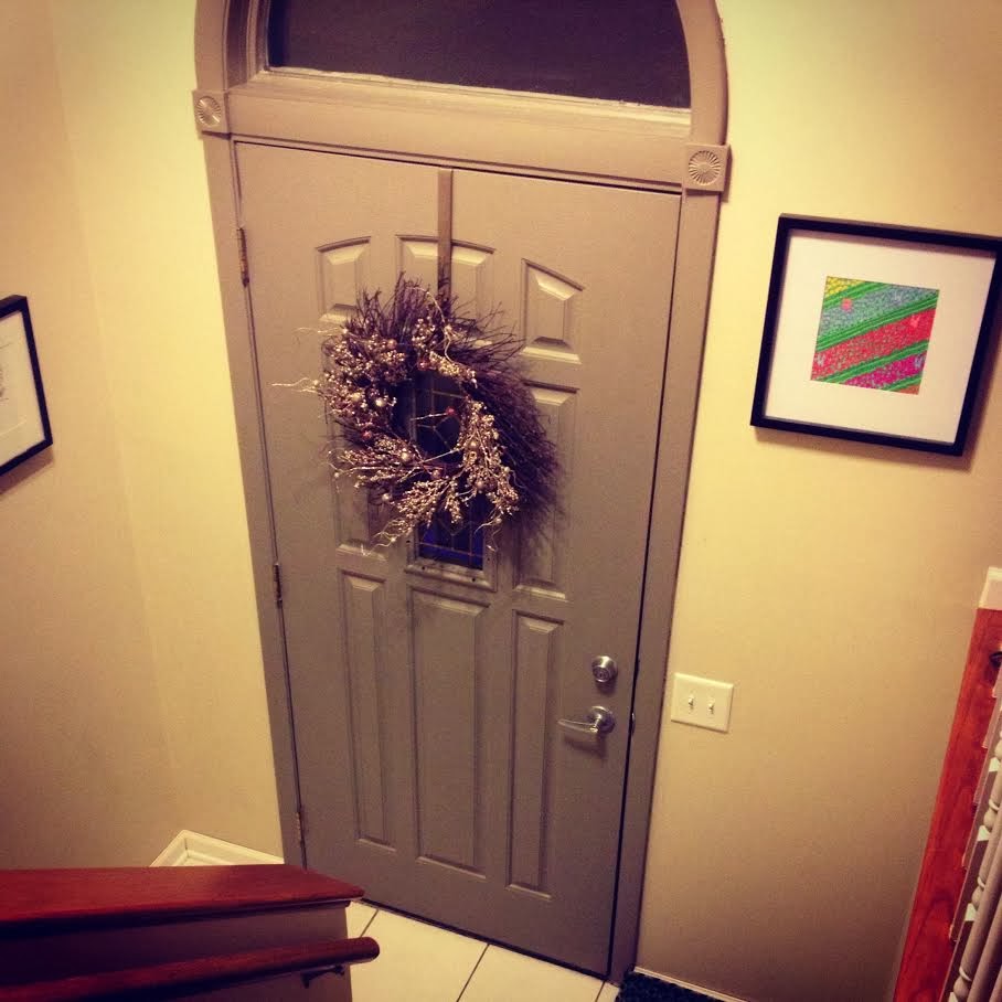
The entrance to our home looked forgotten about. That's because it was. So, I went to my friends at Hirshfields for a little paint fix. I'm still deciding if them knowing me by name is a great thing, or if I truly have deep-underlying issues. Hmm yeah, issues. I picked up a quart of Squirrel Tail by Benjamin Moore in a satin finish. I am totally in love with this color and it is probably because it looks really similar to the door color in Big Bang Theory.
I started out by sanding and priming the door.
My intention was to paint the door on it's own, but I couldn't help myself. Something told me to keep going, so I did. There is no helping that floor by the way. Just ignore the dirt. We obviously do.
This is after the first application of paint on the door, AND trim. I am really happy I went with it. It makes the door look like a solid piece rather than breaking it up. Plus, it really warms up the tiny, almost useless area.
The application process is complete, yo! The floor was even cleaned just for your viewing pleasure.
I am sure there are a million other little things that we could do in our entryway- like make it bigger for one, but we can't, and we won't. All we can do is work with what we have and make the best of it. We hope you have fun making your entryway a bit more special, and grand, like you.
Fun fact- I tried doing research on who designed the split level home. It gave me every other piece of information but that. They probably don't want to own up to it because of crazies like me. If you happen to come across this bit of information, for the love of all things holy, tell me. As always, thanks for reading.


Looking good! I love the idea of a statement hook. Would make sense since we seem to have a wreath hung on the inside of the door year-round! Good work - the door looks 10x better! Tile next!?
ReplyDeleteOh boy, thanks for leaving my very first comment EVER! Very excited! I would love a new entry floor. Convince Shane. ;)
Deletehttp://issuu.com/georgiashpo/docs/split_level_nationally_pdf_version
Delete